The walls are what we see first when entering a home or office as they are on eye level. Artworks that people choose to hang on walls can say a lot about their taste, character, and social status.
When choosing a painting, you should consider the size, orientation, and color.
Choosing a painting orientation depending on wall size and furniture.
Have a look at the available space on the wall. Is it horizontal or vertical? What kind of furniture are you planning to have under the painting?
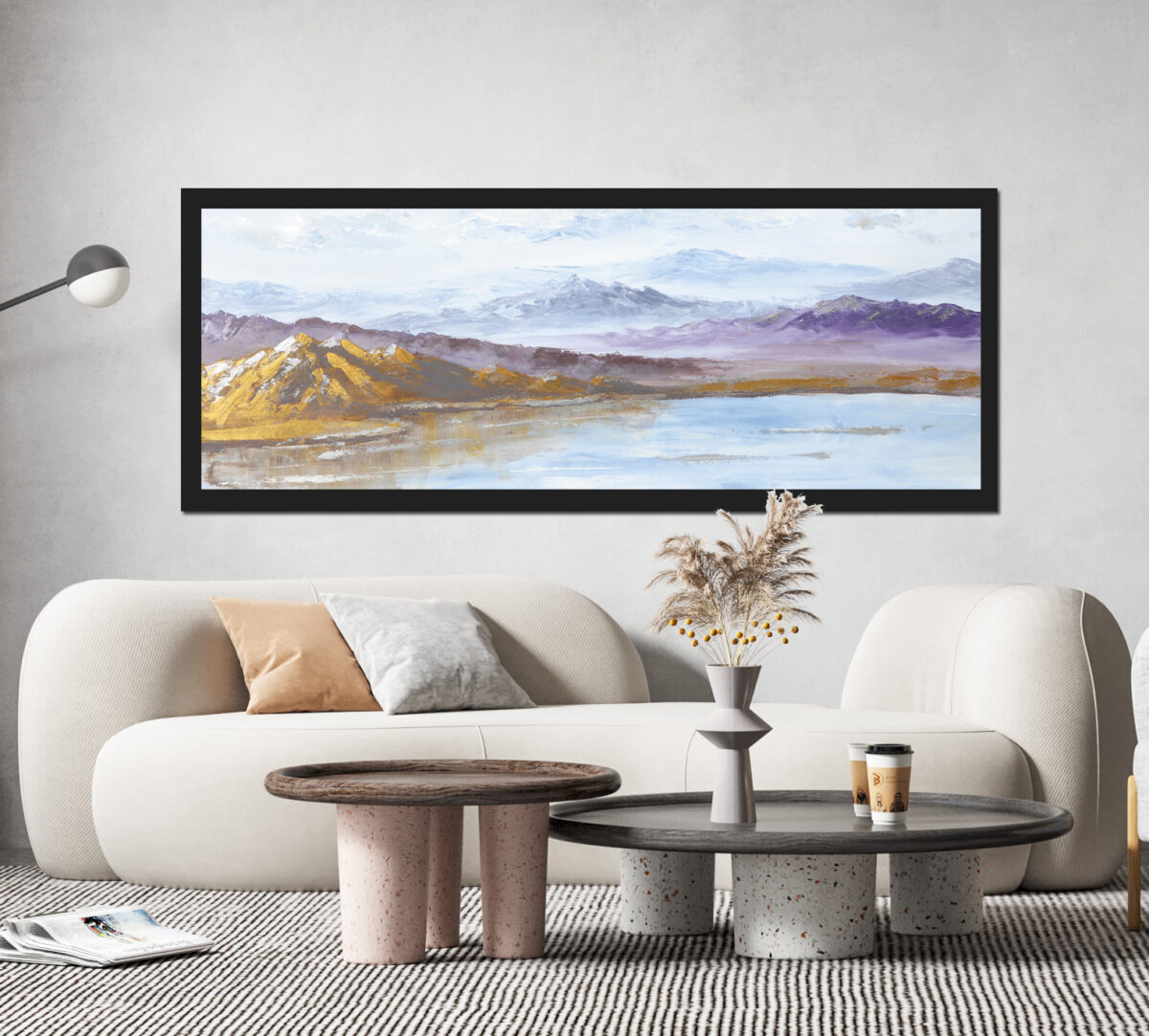
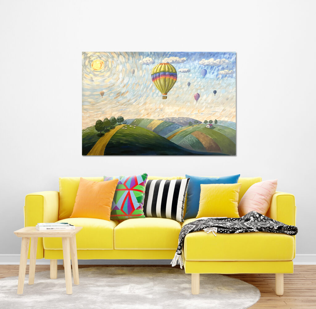
For example, it is better to hang a large horizontal painting above a sofa or a bed as the wall space above is usually horizontal.


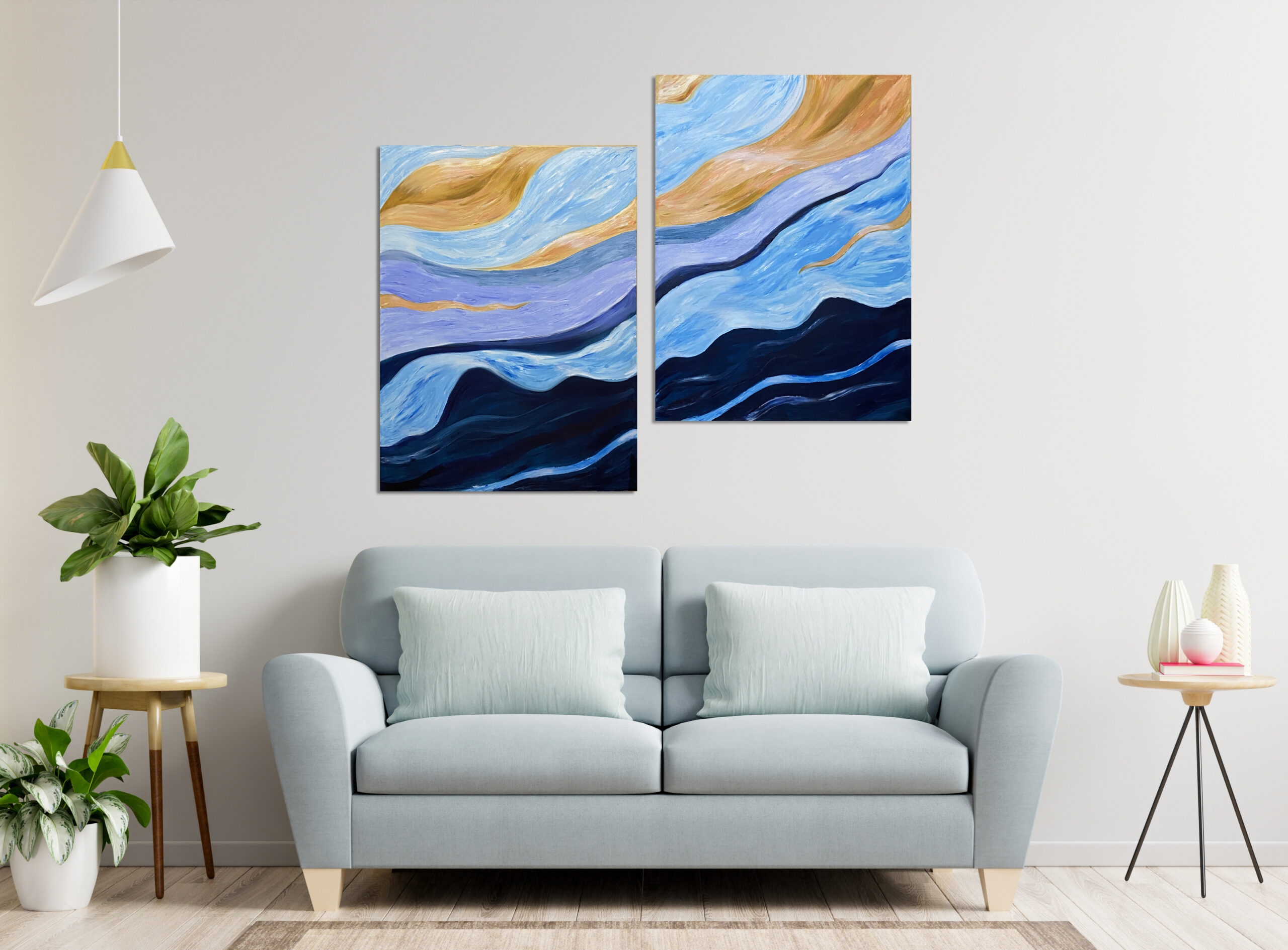
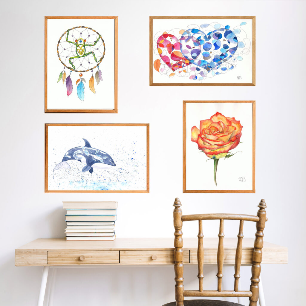
Alternatively, you can hang several matching vertical paintings next to each other to create a gallery.
Vertical artworks look better on columns or narrow walls, above a tea corner or a chest of drawers.
How to choose the size of the painting.
The size of the painting should be selected depending on the wall space and overall space of the room. Large paintings look better in spacious rooms as they are supposed to be looked at from a distance.
Small single paintings or galleries look better on narrow walls in relatively small spaces.
A collection of small paintings can be hung in certain dedicated areas, like a reading room, tea corner, or family corner (small portraits). Such areas can help to create a certain atmosphere of memories, inspiration, relaxation, etc.
How to choose a painting depending on colors and color tone of the interior.
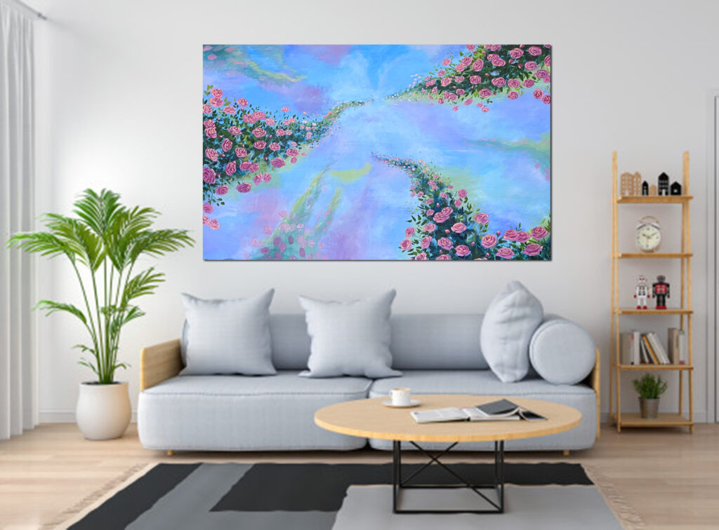
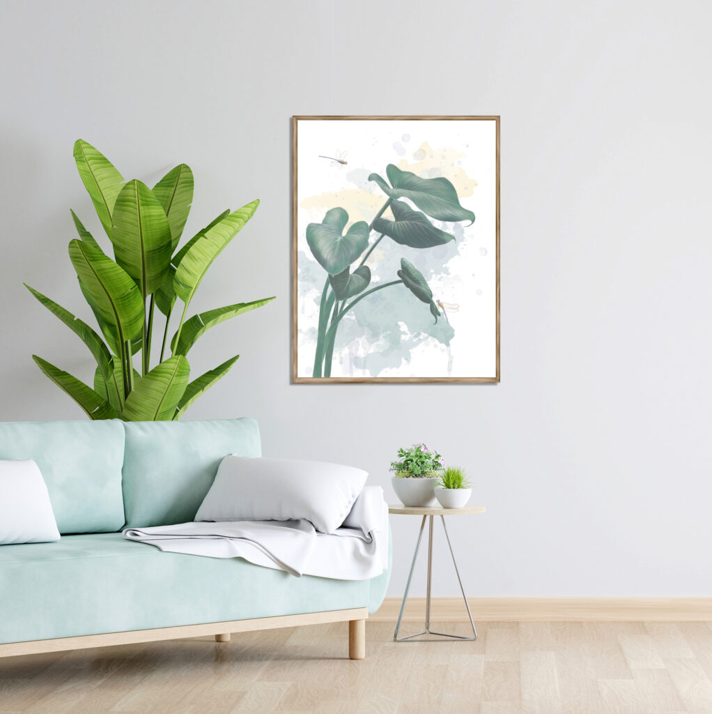
Ideally, the colors of the painting should repeat the colors of the interior. For example, if blue is the dominant color of your interior, it is better to choose a painting with blue as primary or secondary color.
Some people commission artwork to match the colors of their rooms. It is particularly important for living rooms. Optionally, a ready painting can be found with an approximate color match.
The color tone should also be considered. For example, if your furniture is of saturated vivid colors, the painting has to be also of vivid colors. Otherwise, it will be lost in the bright interior.
And on the contrary, if the interior is of pale or neutral colors, it is recommended to use paintings of neutral or pastel colors. A very bright painting will dominate in a neutral interior.
You need to follow these general guidelines when choosing artwork for your interior space. However, many details remain to consider, such as style, material, subject of the painting, and suitable framing.